

HAA now has two products available after our successful professional learning program was completed for 2024 yesterday, Saturday 16 November. Here is some information on the HAA products that are now available for individuals and schools to purchase at https://hassaa.org.au/haa-products/
The Creative Teaching in HaSS Resource is a comprehensive A-Z listing of lesson starters and teaching activities to support creative teaching in schools. The resource includes a 35 page digital resource containing background on creative teaching, over 250 teaching activities (with links to online resources) and a professional learning presentation on creative teaching in the HaSS classroom.

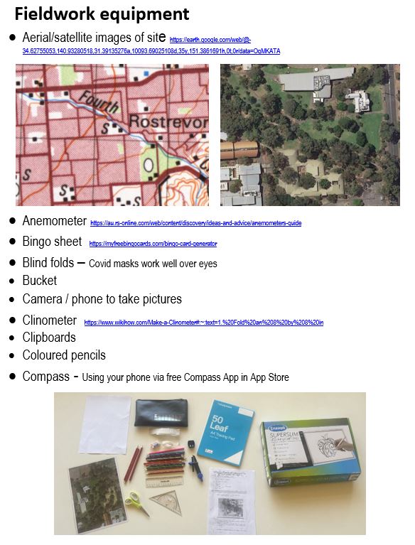
A resource written to support the teaching of mapping and fieldwork in the HaSS classroom. Classroom ready for the HaSS teacher! Lots of mapping and fieldwork ideas and links to resources. The resource includes a 36 page handbook and a professional learning presentation to support HaSS teachers develop an achievable mapping and fieldwork program for their HaSS class.

The cost of the each of the resources:
HAA Members price for individual copy for personal use only: $20
HAA Members price for an unlimited site licence for the resource in a school: $50. This offer is only available for HAA Corporate members. Details on Corporate membership at https://hassaa.org.au/membership-categories/
Non HAA Members price for individual copy for personal use only: $40
Non HAA Members price for an unlimited site licence for the resource in a school: $100
Join HAA at https://hassaa.org.au/haa-membership-form/ to be eligible for the membership price for the resource.
If you wish to purchase the resource, go to https://hassaa.org.au/haa-products/ for the details and order forms.


