Image: Maps used to explain or not explain the Middle East.
Related links to Spatialworlds
Geogaction
Spatialworlds website
GeogSpace
Australian Geography Teachers' Association website
manning@chariot.net.au
Where am I??
Adelaide, Australia: S: 34º 55' E: 138º 36'
The purpose of maps
This posting on maps of the Middle East and religion around the world and in the United States (US). They contain some interesting facts/information about the Middle East, global religious tolerance and the religious affiliations in the US to explain why they are the way they are. The posting also showcases some maps of the Middle East which simply provide facts/information about the region just out of interest without any higher purpose of providing explanations. Maps can be used for many and varied things, not just for analyse and solutions. What is important is that we are using maps and spatial literacy as such to engage students in thinking about regions of the world, in a variety of ways - in an effort to uncover the complexity and uniqueness of the spaces and places of the world.
Maps that explain the Middle East
Maps can be a powerful tool for understanding the world,
particularly the Middle East, a place in many ways shaped by changing political
borders and demographics. Here are 40 maps crucial for understanding the Middle
East — its history, its present, and some of the most important stories in the
region today.
Maps that don't explain the Middle East
Violent upheaval in the Middle East has recently spawned all manner of maps purporting to explain how the region got this way. Here, instead, are 15 maps that don’t claim as much. Or rather, they do not seek, like many other maps, to capture some fixed set of core facts about the region. Instead, these maps provide a more fluid perspective on the Middle East, often by showing what didn’t happen as opposed to what did. But for all these maps don’t show, they do illustrate one thing: the sobering fact that no one map—or even set of maps—can ever explain the region’s complex history and politics.
Another example of the power of maps to explain, this time religious diversity
A pattern of religious diversity and maybe religious tolerance around the world, but not as expected.
The world's
most and least religiously diverse countries may not be quite what we would think. The source of the data for this maps is from an extensive report by Pew that scored
and ranked countries on religious diversity by indexing survey data with a
mathematical model.
The maps shows the most religiously diverse countries are in blue and the
least diverse in yellow. Surprisingly, the map indicates that the three most
religiously diverse countries are in East Asia: Singapore,
Taiwan, and Vietnam. In fact, almost all of the world's most religiously
diverse countries are clustered in two regions: East Asia and West Africa. The least
religiously diverse countries are easier to see, and are typically dominated
by a large Muslim majority: that band of yellow from Morocco, across North
Africa and Middle East, all the way to Pakistan. The very least religiously
diverse country in the world is the Vatican City.
In regards to methodology, while every religion has internal sects and divisions, and while
those can be very important, for the sake of workability comparing across
countries and religions, Pew's data simply divides people into one of eight
groups: Christian, Muslim, Hindu, Buddhist, Jewish, folk religion, other
religion, and unaffiliated. That last category means that non-religious people
count toward a country's religious diversity score.
Here is another way of showing the diversity between a few countries, this time using graphs.
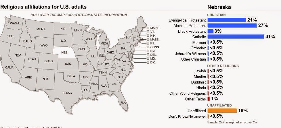
An interactive map of the topography of religion in the United States
A very useful map to get a picture of religious affiliations across the US. We see amazing differences from place to place. Why do these differences occur in their extremes and what impact does it have on the politics of the US? Here are a few more questions such a map stimulates:
* What patterns do you notice? * Are there religious regions that could be drawn based on this data? * What geographic factors have created the differences in the religious geographies of the United States?* How do such difference impact on the nature of the places across the US.