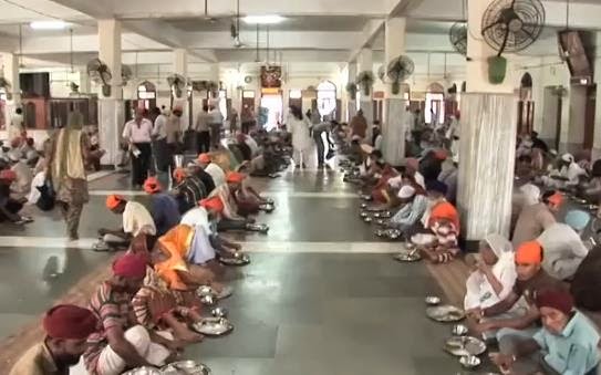
Image: A good news story: The Golden Temple is the holiest shrine of the Sikh religion. It is also home to one of the largest free eateries in the world.
Related links to Spatialworlds
GeogSplace (a teaching blog for Year 12 geography)
Geogaction
Spatialworlds website
GeogSpace
Australian Geography Teachers' Association website
manning@chariot.net.au
Where am I??
Adelaide, Australia: S: 34º 55' E: 138º 36'
GeogSplace (a teaching blog for Year 12 geography)
Geogaction
Spatialworlds website
GeogSpace
Australian Geography Teachers' Association website
Where am I??
Adelaide, Australia: S: 34º 55' E: 138º 36'
In a previous posting I explored the idea of Geogphobia and the need for some 'sunshine geography' to engage students in the WOW (World of Wonder) of geography. Such an approach is not denigrating the importance of students addressing geographical issues and problems but is saying that we should not start with the deficit model but have students see the wonder of the world before exploring issues.
It is impossible as a citizen not to avoid the bad news in the media - it feeds on it!! The classroom needs to be much more strategic when we are working with the development of values, attitudes and perspectives related to the fragility and dynamism of our world. The negativity of the 24 hour news cycle in relation to the environment came home to me recently at a workshop when I asked participants the question; "how much of South Australia's energy needs come from wind energy?" Most participants guessed that it was about 5-10%. In fact, in 2014 South Australia generated up to 30% of its energy needs from wind power and in July this year enough electricity was generated from wind farms to meet a record 43 per cent of the state’s power needs, and on occasions during the month provided all the state’s electricity needs. Even more impressive is that the combination of wind energy and rooftop solar has provided more than 100 per cent of South Australia's electricity needs for a whole working day between 9.30am and 6pm several times over recent months .
Now that is a South Australian good news story! On those same days wind energy accounted for 12% of Victoria's energy needs - also impressive considering Victoria's energy needs!

Interactive daily South Eastern Australia wind energy map
On the theme of the media only focusing on bad news in relation to the geographical world (a phenomena called death geographies), I thought the following article from Business Insider Australia was incredibly pertinent.
OK, Haters, It's Time To Admit It: The World Is Becoming A Better Place
"Some people love to complain about how horrible everything is all the time. And there are certainly plenty of horrible things to complain about. People are mean, for example. And people get sick. And there are horrible accidents and injustices and tragedies and unfairness everywhere. And there is Ebola. However it is nice sometimes remind ourselves that some things — many things, in fact — are getting better all the time. "
Over at the Oxford Martin School, Max Roser has put together a provocative article and presentation entitled, “It’s a cold hard fact: Our world is becoming a better place.”
Roser includes lots of facts that will drive the haters crazy and show that our world is becoming a better place. What follows are a range of graphs over time showing change in health, wars, poverty, feeding of populations, democracy and political freedoms around the world. The trends are all downward ... but are they just clever use of statistics?
* War and battles have declined over time

* The Visual History of the Rise of Political Freedom and the Decrease in Violence

* Health

(The Our World in data has an amazing number of visualisations on world health)
* Feeding the world

Poverty

* Democractisation of the world

Our World in data - great visualisatons to show change
The visualisations above relating to good news stories have come from the excellent site by Max Roser called 'Our World in data'. Max Roser, is a James Martin Fellow researching income inequality and inclusive growth at the Institute for New Economic Thinking, Oxford Martin School. Of particular interest is that much of the visualisations on this site are perfect for some of the geographical thinking in relation to the Change concept of the Australian Curriculum: Geography - to show that change is not always a deficit as we study geography. However there are also plenty of visualisations on the site to show that things are not getting better i.e forest cover and CO2 emissions
Roser explains the thinking behind his OurWorldInData.org online resource:
"Is it actually true that we are building a better world? Or are those who claim that things are always getting worse the ones in the right? Whether we're discussing the way of the world over a pint in the pub or dissecting the issues at an academic conference, it’s a topic that lingers constantly: how is the world changing?
The evidence to answer these questions is out there, but it is often obscured by media headlines. So we created OurWorldInData.org to present long-term data on how our world is changing. Using empirical data, visualised in graphs, we tell the history of the world that we live in, looking at long-term economic, social and environmental trends. For each topic the quality of the data is discussed and comprehensive lists of the data sources are provided, giving a trustworthy and transparent starting point for researchers.
The evidence shows that we are becoming less violent and increasingly more tolerant, that we are leading healthier lives, are better fed, and that poverty around the world is declining rapidly. Taking these facts into account paints a very positive picture of how the world is changing."
.
No comments:
Post a Comment