Showing posts with label infographics. Show all posts

Monday, January 11, 2016

Information is beautiful


Image above: An infographic showing country number one's, the work of David McCandless who says he wants to 'distill the world’s data, information and knowledge into beautiful, interesting and, above all, useful visualisations, infographics and diagrams'. A fine cause for us geographers.

Related links to Spatialworlds
GeogSplace (a teaching blog for Year 12 geography)
Geogaction (geography professional learning blog)
Spatialworlds website
GeogSpace

Australian Geography Teachers' Association website
manning@chariot.net.au

 
Making data live!

A previous Spatialworlds posting highlighted the importance and potential of visualisations to student learning - the importance of visualisations to provide proportional spatial information on a topic to help expose the truth, develop perspective and inform. That posting also proposed the idea that data tables in books are where data goes to die and that the potential of visualisations in the form of infographics is a powerful learning and engagement tool for students. With these thoughts still going around in my head, I was excited to find a great website called Information is beautiful

The site is full of some great infographics, discussions, inter-actives and ideas about how to creatively represent data. The site and the available book, also called Information is beautiful contains some amazing infographics which certainly blow apart some commonly held myths, provide copious information and some great 'out of left field' perspectives on a wide range of topics/issues - all that could be made relevant to the geography classroom.

The work is the brainchild of David McCandless, a London-based author, writer and designer. David has a passion for visualizing information – facts, data, ideas, subjects, issues, statistics, questions – all with the minimum of words. In particular he is interested in how designed information can help us understand the world, cut though mis-truths (BS he calls it) and reveal hidden connections, patterns and backstories - all very geographical! Interestingly he says his pet-hate is the representation of data as pie charts - hence expect to see data represented in all shapes and sizes - but not pie charts.

To give a taste of what David's work offers the geography/history/social science/humanities teacher, I have picked out just a few that I found fascinating. Have a play with the following infographics, the first two are interactive and certainly makes one think and challenges some assumptions and thought truths! - others just provide some really useful and easily digestible information.


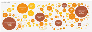


Have a look at the infographics on the site, you will be hooked and certainly inspired to doing something with them. Think about visiting David's blog and Twitter feed - and even buy his books!

 Why not get your students doing infographics?

If you are inspired by David's work, consider using some free infographic maker websites. There are plenty on the Internet and they can be a really useful classroom tool for student learning.

Friday, November 21, 2014

Geography: from the stimulating to exhilarating


                                     everything has to do with geography

Related links to Spatialworlds
GeogSplace (a teaching blog for Year 12 geography)
Geogaction
Spatialworlds website
GeogSpace

Australian Geography Teachers' Association website
manning@chariot.net.au

Where am I??

Adelaide, Australia: S: 34º 55' E: 138º 36'


“I’m a geographer, frankly, I’m proud of that fact even if I have to explain when I meet someone exactly what it is a geographer does.”
Associate Professor Andrew Shears (a fascinating geography blog to check out from Andrew)

As frequently mentioned on this blog, there is a disconnect between what geographers think geography is and what the community and non-geographer educators think geography is. In fact, there is even arguments on the matter between geographers i.e. the physical geography versus human geography debate. Whilst the perception of geography varies enormously, one of the good things coming out of the implementation of the Australian Curriculum: Geography is that  geographers are working with teachers and parents to enunciate what they see geography as. I was amused by the following example of a typical discussion geographers tend to have with those trying to get a grasp of what geography is in the 21st Century - an exhausting, but necessary role for us geographers as the curriculum is implemented!

Imagine the poor geographer trying to explain to someone exactly what it is he or she studies.

“Geography is Greek for ‘writing about the earth.’ We study the Earth.”
“Right, like geologists.”
“Well, yes, but we’re interested in the whole world, not just the rocky bits.  Geographers also study oceans, lakes, the water cycle…”
“So, it’s like oceanography or hydrology.”
“And the atmosphere.”
“Meteorology, climatology…”
“It’s broader than just physical geography.  We’re also interested in how humans relate to their planet.”
“How is that different from ecology or environmental science?”
“Well, it encompasses them.  Aspects of them.  But we also study the social and economic and cultural and geopolitical sides of–
“Sociology, economics, cultural studies, political science.”
“Some geographers specialise in different world regions.”
“Ah, right, we have Asian and African and Latin American studies programs here.  But I didn’t know they were part of the geography department.”
“They’re not.”
(Long pause.)
“So, uh, what is it that you do study then?”
―    Ken Jennings 

Just to emphasise the difficulty for many to get a purchase on what is geography, I thought it would be fun in this posting to pick a mixed-bag of sites, from the stimulating to exhilarating to show the diversity of topics studied under the banner of geography. As Judy Martz is quoted as saying in the image at the top of the posting,  everything can be studied in geography, as long as it is studied geographically!  What does that mean? With the Australian Curriculum: Geography it means to look at what we study through the lens of the seven key concepts of place, space, environment, scale, environment, sustainability, interconnection and change - to think geographically on a topic/area of study is what makes geography geography.  Now just enjoy these amazing examples of geography and geographical thinking!

The stimulating!

* A Meandering stream


* Visualising global urban growth 

An interactive data visual covering all cities with 500,000-plus inhabitants – illustrates the scale and speed of urban transformation that research by the International Institute of Environment and Development (IIED) has sought to document and describe. A guide to its use can be found underneath the visual.

* Who lives where in Europe? Nationalities across the continent mapped

People of many different countries are now living in Europe, with the continent's residents coming everywhere from Jamaica to Tuvalu. Using data from 2011 censuses this interactive maps the prevalence of different nationalities across the European continent. Pick a country and the map will tell you how many people from that country live in each* European state


* Women's rights: country by country

Which countries have laws preventing violence? Which legislate for gender equality? And which countries allow abortion? Using World Bank and UN data this interactive offers a snapshot of women's rights across the globe


* Instant thematic maps on demographics 

 A great resource to make demographic geography interactive. Index Mundi is home of the Internet's most complete country profiles. The site also contains detailed country statistics, charts, and maps compiled from multiple sources.


* The geography of stolen cars: why the difference from place to place must be the geographical question?


* Worldometer 

Live world statistics on population, government and economics, society and media, environment, food, water, energy and health.


* Mapping children's chances 

Excellent maps displaying the standard of living available to children around the world. These maps help us to understand the quality of life present in different countries around the world. This is the biggest ever global picture of children’s well-being, education and family life has been assembled into a series of maps by the University of California, Los Angeles. "When you look at a map, everyone's eyes go straight to where they live," says Dr Jody Heymann, director of the university's World Policy Analysis Centre.


... and the exhilarating!

* Norway, a time lapse adventure


* Climbing Mount Everest in 3D


Thursday, December 12, 2013

Change over time visualisations


Image above: The Pinnacles in Western Australia. 


Where am I??  
Adelaide, Australia: S: 34º 55' E: 138º 36'


A visualisation of change over time

The change concept of the Australian Curriculum: Geography can be brilliantly demonstrated by visualisation videos and Infographics showing change over time. Here are just  a few.

* Visualisation of US expansion in North America from 1700 to 1900, seen through changes in the spatial distribution of post offices. The data from the USPS Postmaster Finder, with lat/long coordinates extracted from placenames through correlation with the USGS Geographic Names Information System.There is also an interactive version of this map.  More can be found at blog.dwtkns.com/2011/posted/ 


Many twitter users reply to their friends' tweets. When both the original tweet and the reply include location data, we can show the connections. The result is a depiction of the replies spanning the globe during one day. 

* Watch the world get older

The graph shows how, over the course of a century, Japan shifts from a nation where
children predominate to a nation of senior citizens.


A very interesting infographic using words to show change of focus with Presidential speeches.

Global Climate Change visualisation

A video data visualisation showing the change in temperature across the world over the last 200+ years. It is based on the data released by the UK's Met Office in Dec 2009.


Thursday, March 14, 2013

Geoinformation galore

Image above: Where the hell is Matt? Matthew "Matt" Harding (born September 27, 1976), is a traveller, video game designer, and Internet celebrity known as Dancing Matt for his viral videos that show him dancing in front of landmarks and street scenes in various international locations


Geoinformation is the name of the game

Information galore can be gained through trawling the Internet for Infographics, maps, video, simulations and cartoons on all things geographical. No longer are books our key source of information. Whilst books continue to be important sources of the academic and published, most of the population, including students are now getting their information from other sources.  The Internet based sources do much of the translation of the information into the forms of infographics, maps, videos and blogs. Such translation of information requires increased levels of critical literacy by the viewer/reader to weed out bias and false interpretation. To highlight the fantastic geoinformation sources out there for us to view, here are just some. They are all concise, many visual and all easy to interpret.  


* Economic inequalityinfographic

* James Bond travel map
Where in the world has 007 been in his 30 movies? If that's a question you've always wanted to know, then this set of maps was made just for you

* Human Development Index: This video shows the basic concept of HDI (Human Development Index), by using four different examples (Japan, Mexico, India and Angola).

* Saudi Arabia is drilling for a resource possibly moreprecious than oil.  Change over space
Over the last 24 years, it has tapped hidden reserves of water to grow wheat and other crops in the Syrian Desert. This time series of data shows images acquired by three different Landsat satellites operated by NASA and the U.S. Geological Survey.

A new study using data from a pair of gravity-measuring NASA satellites finds that large parts of the arid Middle East region lost freshwater reserves rapidly during the past decade.


Learn how advances in geospatial technology and analytical methods have changed how we do everything, and discover how to make maps and analyze geographic patterns using the latest tools.


This video is a good way to introduce the discipline of geography and the class subject matter.  While geography may appear to be eclectic sets of random knowledge, it is that spatial component that binds the various sub-disciplines as a coherent whole


* Migrations map
Interactive migrations map: where are migrants coming from? Where haev migrants left?

* A new way to illuminate inequality around the world. A way to know where the poor live? Look at where the light is?
The geography of religion, even in an era of secularization, is still a powerful  indicator of many patterns of human geography.  What is the religious profile of your state?  What is the spatial distribution of the religious tradition with which you identify?  What explains those spatial patterns?
Mapping a survey of rankings from a variety of sources