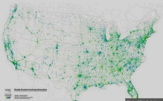
Image above: From the 40 Maps that explain the world from the Washington Post blog. Some great representations.
Follow Spatialworlds on Twitter
Email contact:
Where am I??
Adelaide, Australia: S: 34º 55' E: 138º 36'
Can you see a distribution and/or pattern?
In the Inquiry and Skill Strand of the Australian Curriculum: Geography there is frequent reference of the geographic skill of identifying distributions and patterns when studying visual representations of geographical data. As stated in the Year 7 Skill Stand under the Interpreting, Analysis and Concluding stage of Inquiry, students are to be able to:
"Analyse geographical data and other information using qualitative and quantitative methods, and digital and spatial technologies as appropriate, to identify and propose explanations for spatial distributions, patterns and trends and infer relationships."
The visual representations of maps, graphs and images (remote sensed images or pictures) we use in geography provide the opportunity to identify distribution, patterns and trends. In fact, such a skill is at the core of understanding and applying the Space concept in the curriculum. As is stated in the Organisation section of the on-line curriculum.
"The concept of space is about the significance of location and spatial distribution, and ways people organise and manage the spaces that we live in."
Here are just some of the great representations available on-line. Go to my Spatial Literacy Scoop.it for a extensive curation of such maps.
We think of slavery as
a practice of the past, an image from Roman colonies or 18th-century American
plantations, but the practice of enslaving human beings as property still
exists. There are 29.8 million people living as slaves right now, according to a
comprehensive new report issued by the Australia-based Walk Free
Foundation.
* Overlaying Christaller on Google Earth: Patterns? Yes or no? A fascinating use of old geography with new geographical technology to study patterns and theories of spatial distribution and patterns.
* The Geography of drunk driving – patterns not easily
explained by density of cars alone!
A series of maps of India helping to see patterns to birth control
success.
* From the past: As mentioned previously in a Spatialworlds posting on John Snow's work, finding
patterns through maps for the betterment of society is nothing new. Here is John Snow’s Cholera map from the 19th Century recreated with modern spatial technology.
* Maps to never forget
Finally here are a whole lot of maps of things from daily fat intake, alcohol consumption, marriage rates to happiness levels. The maps are a great resource for students to identify and
hopefully explain distributions and patterns through maps. Here are just a few
There are so many more maps of this ilk on-line for use in the
classroom. Such maps are often referred to as Map Porn because of their
quirky and seemingly useless nature beyond stimulation (however every map is likely to be useful to someone!). One thing is for sure, they are growing rapidly in number
and are potentially a great resource for the classroom to engage students in
mapping, to learn about aspects of their world not often studied and to develop the
skills of identifying and explaining distributions and patterns.


No comments:
Post a Comment